The Smart CUHK Challenge
Identity
2022, Hong Kong
Design Director: Woody Chau
Art Director: Can Chan
Designer: Rita Leung
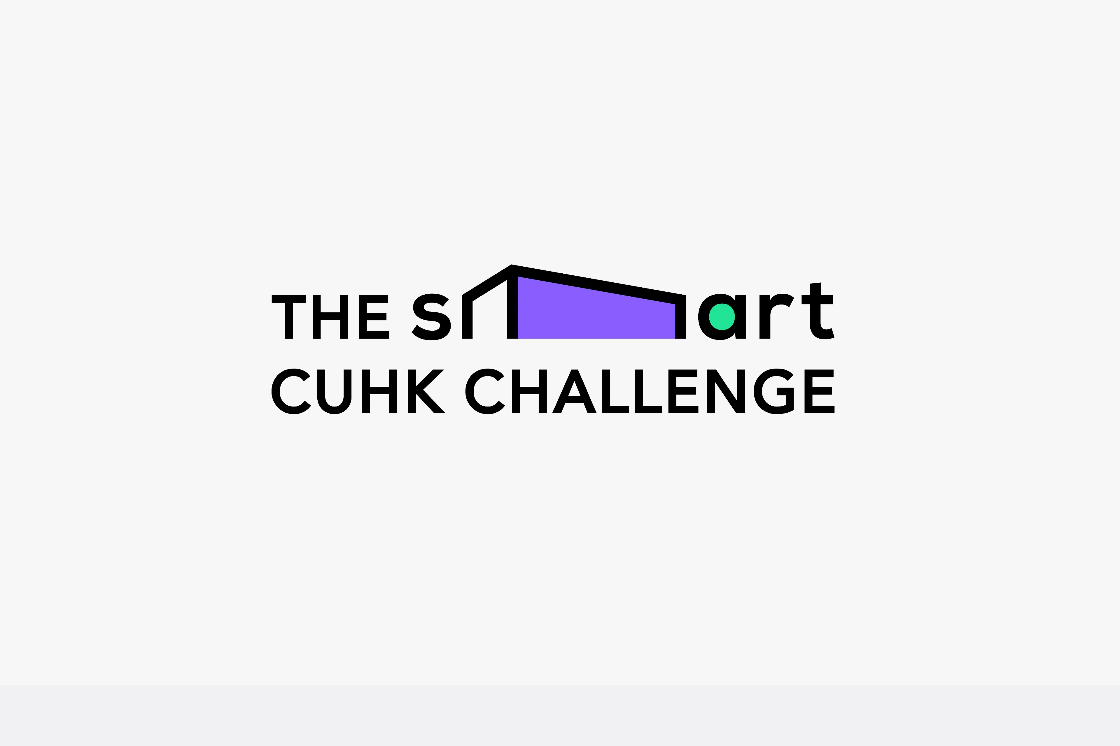
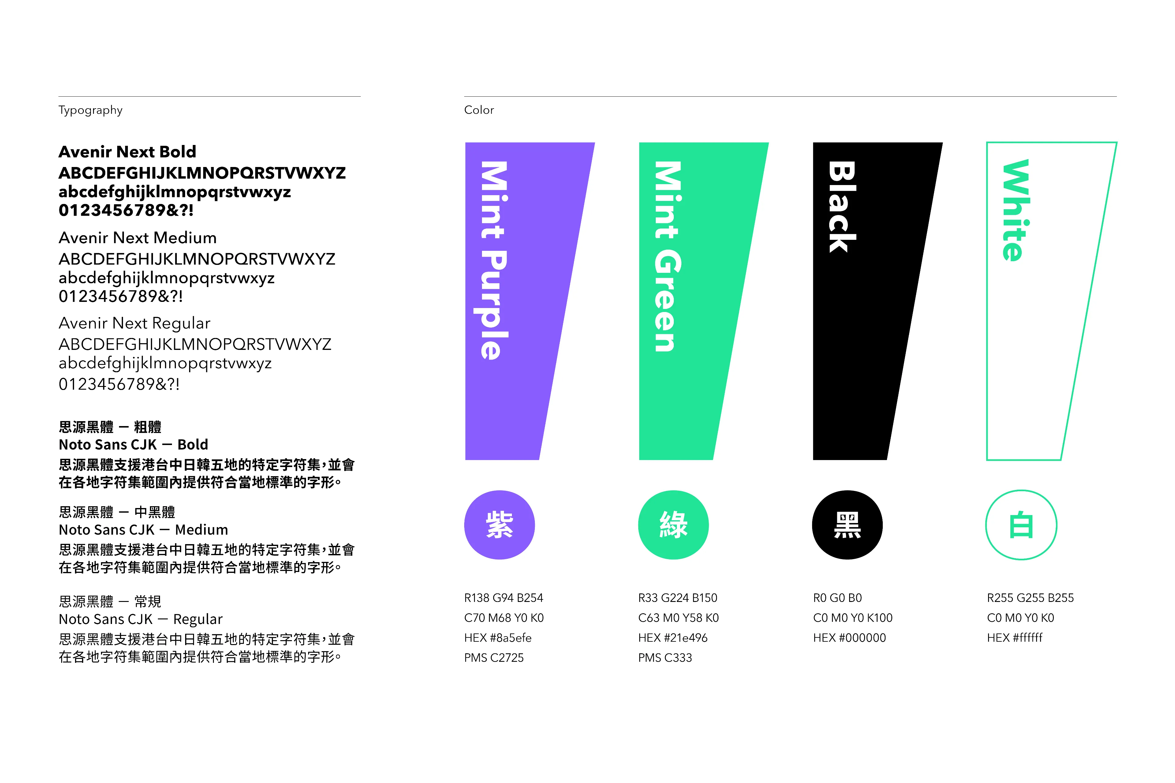
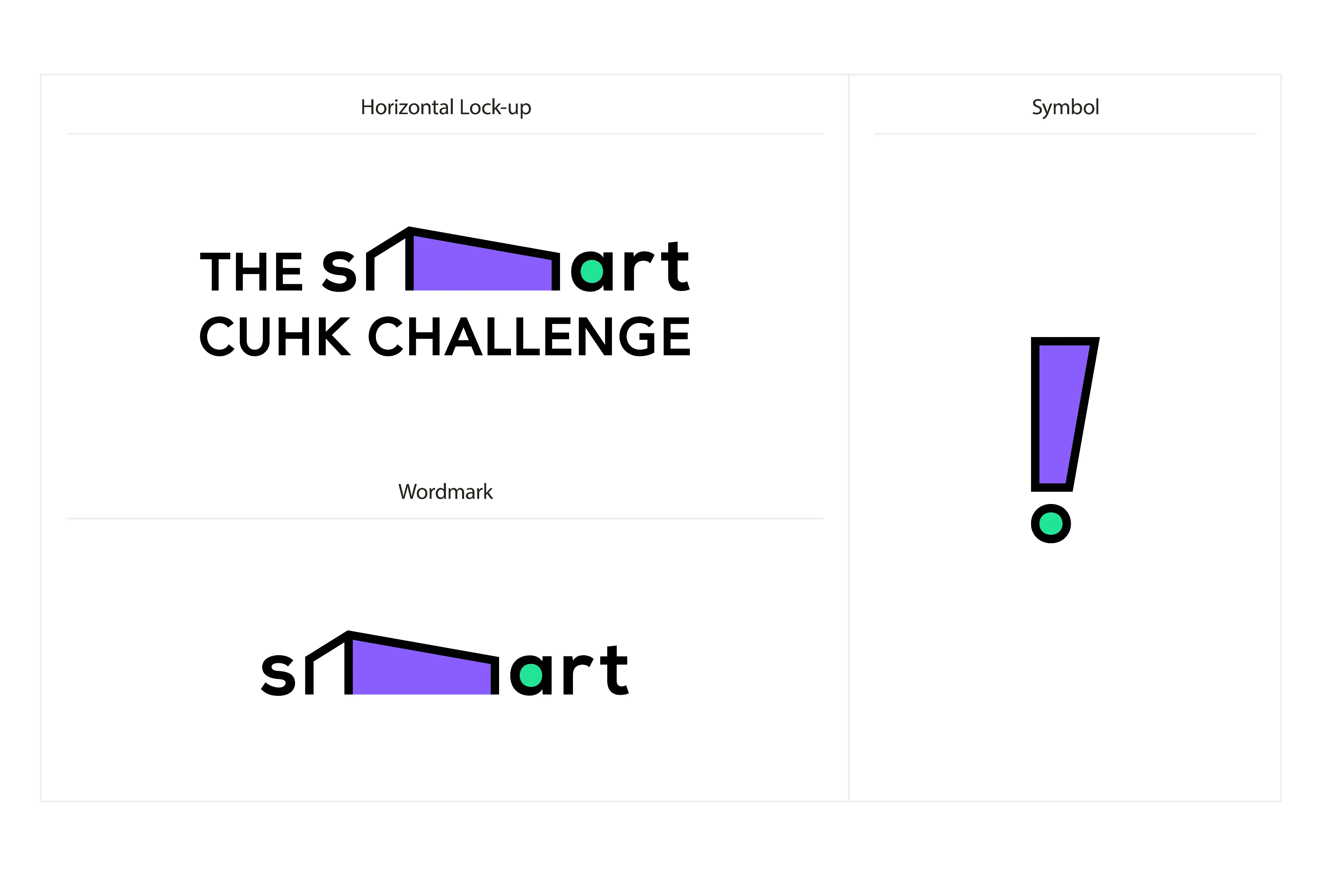
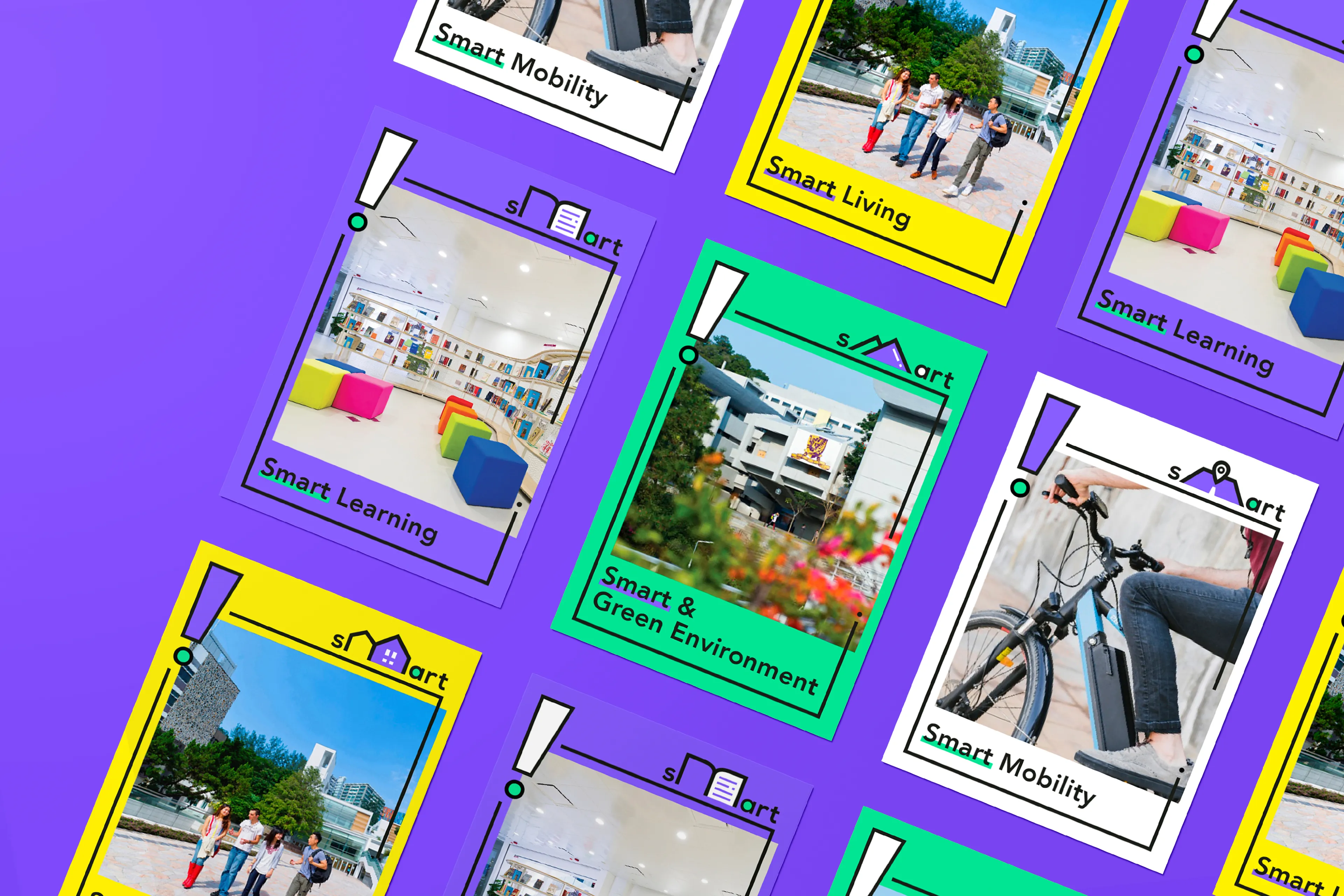
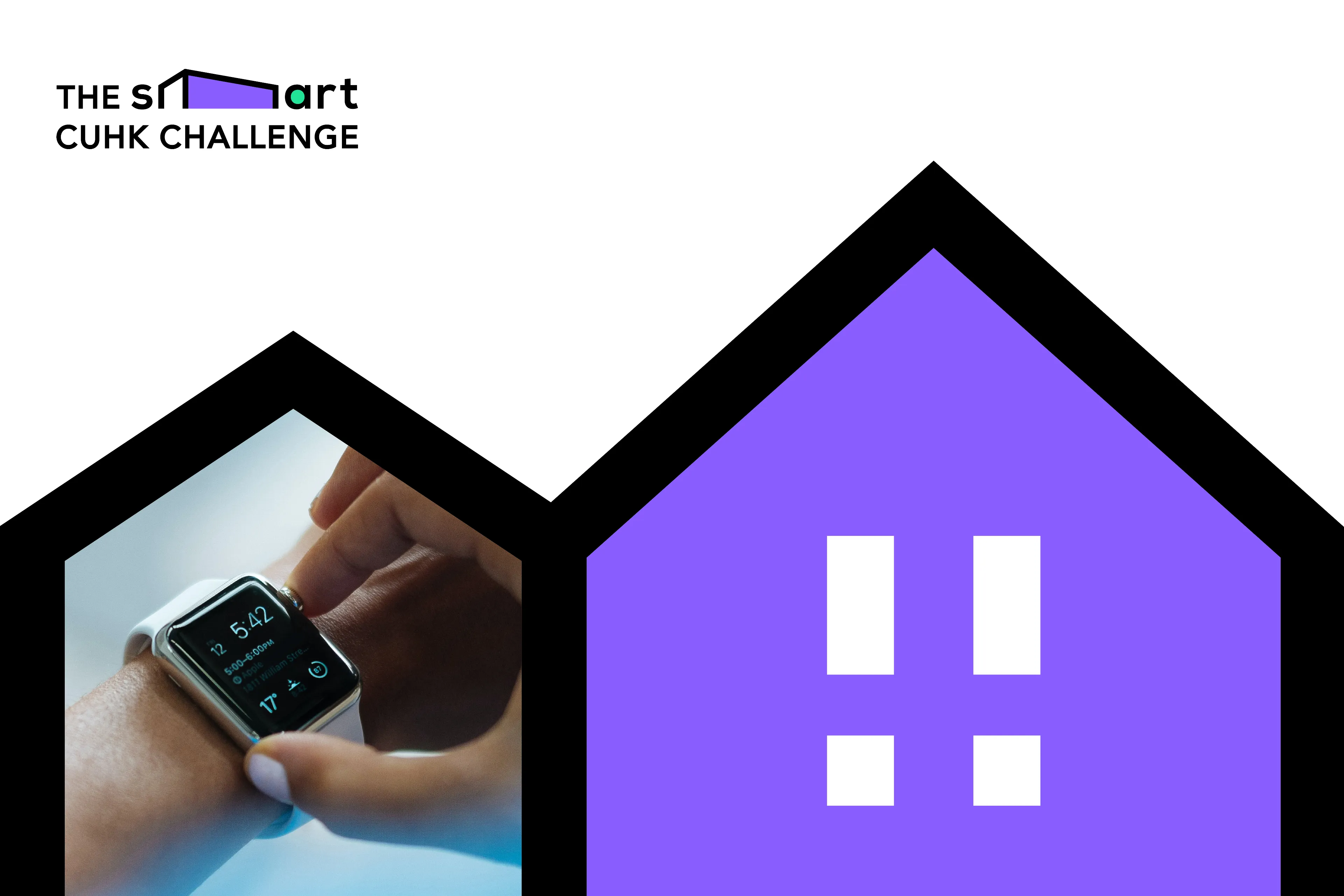
The concept of “creativity in campus” is highlighted in the logo’s typography of “SMART”. The multi-dimensional “M” represents the creative thinking needed for smart design for the future. Fluid elements added in the creation of “M” echo with the transformation and flexibility required for presenting the competition’s theme. The logo design is based on the motif “think in different angles”. When people finally reach the answer , “!” is what one could instantly feel . An exclamation mark is thus hidden and can be seen when the logo is reversed 90 degrees. The contrast of highly saturated purple and green adds vigour and intensity into the design.


Related Projects

view